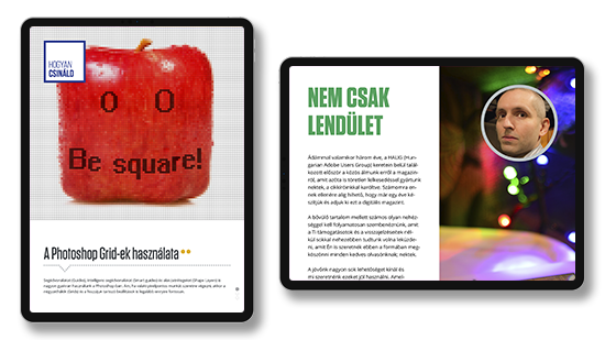
This was a free digital magazine for professional digital designers, graphic designers, content creators and design enthusiasts. Me and my professional partner found the magazine after we realized this niche in the market while we were also working together in Hungarian Adobe User’s Group.
After the release of Adobe Digital Publishing Suite, any kind of small party or group can issue their own magazine basically. The original idea was to create a free magazine for the professionals to help them get to know the design profession through interviews with other professionals, tutorials, articles about trending topics, professional opinions, technological advances in the field and small professional dictionaries over different topics.
The business model was based on the advertisements in the magazine. We spent the first years with Adobe DPS but after they changed the regulation and it become required to make an individual contract with Adobe then we switched our own system. Sadly we were lack of budget for the development. The application stayed in only iOS state and – because of this – we cannot reach enough readers.
The magazine was founded in 2013 and after a couple of years we abandoned the project and it was phased out.
My main tasks were professional writing, editorial writing, layout editing, proofreading and conducting interviews with other professionals or partners. Here you can see my work on the magazine.
The basic layout was very similar like in a case of real print-out magazine. We designed the content for iPad size pages and helped the readers with visual elements such as arrows.
We decided not to make articles longer than 4-5 pages. These pages was created wiht a help of InDesign. After the proofreading we implement the pages into Adobe PDS.
A 4-page article about the OpenType standard. The main layout contained two column. The reader can read from up to down with swiping the pages. If the reader swiped the article left or right direction then the previous or next article loaded into the screen.
Click on the pictures to open the gallery.
We founded a free digital magazine for professional digital designers, graphic designers, content creators and design enthusiasts.
A typical 5-page article was the longest spread in the PixelDesigners Magazine layout.
In this article, I used a lot of screen cut-outs. For these cases, we used Scotch tape visual elements to express to communicate these weren’t full screens just a part of the whole computer screen. Although our main UI design style was basically flat this element gave us some skeuomorphism.
In this particular article, we purposely broke the normal reading rhythm and logic but helped the readers with arrows again.
Click on the pictures to open the gallery.
After a first couple of common meeting with my funding partner we agreed that we need to create an easy to use UI and logic for the articles. With this decision we wanted to make a fluent reading experience as well. The simple but elegant UI was important from the start but at the first year we hadn’t implement videos or complex interactive elements although the possibility was there because we used the Adobe Digital Publishing platform.
The simple but elegant UI was important ... to make a fluent reading experience.
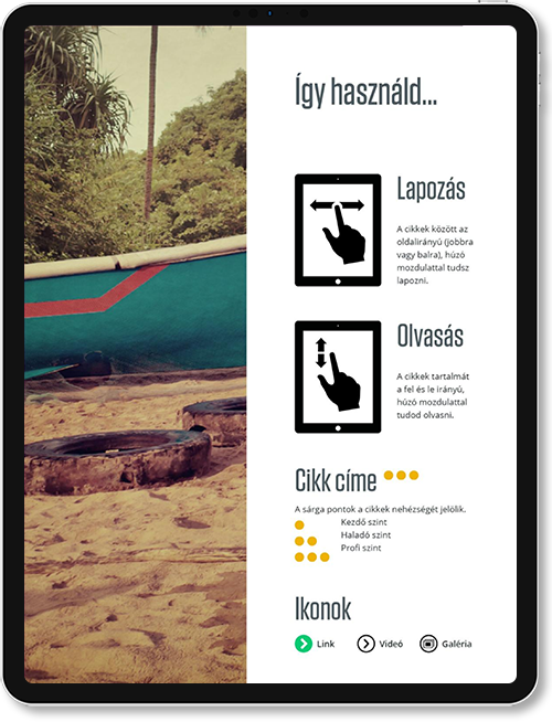
This was the user manual of the magazine. In the beginning we put it this short guide after the table of content. This is also helped to create the understanding and fluent reading experience to the users.
The side swipe was the gesture for the paging. The reader chose the article what he/she wanted to read. (upper figure)
With the vertical scrolling (swipe) gesture the reader could read through the article in the correct page and reading order. (lower figure)
Every article and content got a professional level which is meant to be an indicator of the professional knowledge required to understand it. We had free different levels with a maximum of 3 light orange dots. The levels were beginner, advanced and expert.
The integrated part of the UI were the other three icons that you can see in this guide. The green circle with an arrow is meant for externals links and we usually put the description of the link next to the circle. The white circle served the purpose of the videolinks also with some description next to it. The third icon is meant to be the gallery for the article with several HQ pictures about the topic. All of these could be external links.
I designed, wrote and implement many articles into our magazines through the active years of its life. Here are most of my articles with their front page and a small description of what was the actual article about. The articles were written and published in Hungarian originally. After a couple of years, we managed to reach 1500 readers but it was too small as a reader base to survive the next years and for consolidating our business plan without any further income. These articles created from 2013 to 2015 by me.
I wrote many articles into our magazines...
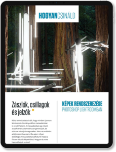
A tutorial article about how to organize a photo collection with Photoshop Lightroom. The functions were very close to the Adobe Bridge solution.
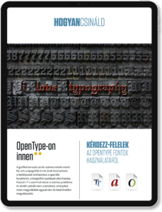
Advanced usage of OpenType fonts with Q&A session based on the readers and Hungarian Adobe User’s Group (HAUG) questions about the topic. A comparison of the three main font standard was also a part of the article.
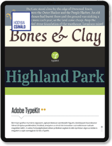
That was an article about the practical usage of Adobe TypeKit when it was new on the market and just made of its debut on Adobe Creative Cloud. That’s why the disadvantages of the solution was also a main part of this article as well. There were pros and cons back in the days.
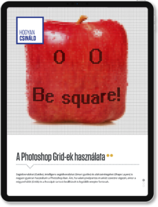
That was a tutorial article about the usage of grids and guides in Photoshop. It helped to understand how we can work within a pixel accurate project or create pixel arts. I also spent some focus on the Shape layers and their pixel accurate positioning.

That was a simple analytic article about the future of personal computers and their usage next to mobile gadgets such as smartphones and tablets based on Statista data. I also looked at which kind of tools favored by user habits.

This was an intro article. My and my partner wrote these articles on the first page of our magazines. Usually these were a small analytics with our personal sights in order to what happened since the last issue and what topics were the hottest in that time.
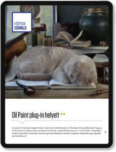
This article born as an answer for the many users who start to complain about the disappearance of Oil Paint plug-in in Photoshop. I wrote this guide for help them to create graphics with oil paint effect but without the original plug-in.
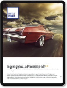
This article was also born as a reaction to members of the Hungarian Adobe User’s Group questions. They wanted to know how they can speed up their Photoshop. Many statement of this article still true in 2022.
And at the end, you can see my own business card which I used while I was working on this project. Unique design and bright color for greater recognition. I always loved to create unique but simple and elegant designs.
I love to create unique but simple and elegant designs.
