The project goal was to create an easly usable menu structure for those who browsing on the website with their smartphones. The dialer menu as an idea wasn’t new but we implemented this controlling system into the whole website UI. The new menu appeared only on the case when the users browsed with their smartphones. The basic idea was the usage of an organic controlling system.
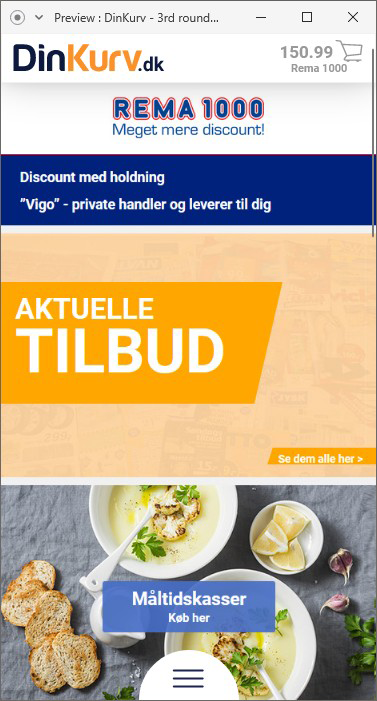
Dinkurv.dk was a little start-up (now shutted down) company based in Aalborg. The company focuses on online grocery shops and they have developed a price comparison and basket collecting web solution. The portal was make the customer’s product selection easier and allows for comparisons across stores so you can find a cheaper basket.
Based on user research and online research about the usage of the solution (website) the data showed us our customers mainly use their mobile devices for collecting and making their baskets. While the screen structure is usually enough for the main controlling menus, buttons and information on computer screens then is much different on the mobile and tablet platforms.
That was the point when we start to thinking about some new UI. We didn’t want to develop a whole new mobile application. We agreed that we have to create a simple and cost effective solution for this purpose. Because the website was originally build on HTML 5.0 and JavaScript I suggested to develop a new dialer like menu on a layer which is only working if the customer using/browsing our website on mobile platforms. In this way, we could make a better user experience and can make more purchase through the website. Usually, I love to create low-fi sketches throughout the whole ideation process to help me understand the ideas and visualize those.
I love to create low-fi sketches throughout the whole ideation process.
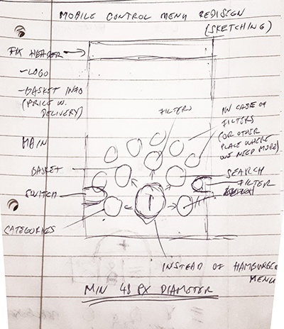
My original sketch from ideation phase.
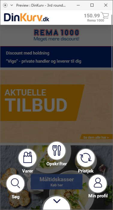
The original idea was developing a ‘gooey’ or ‘dialer’ menu. It will contain the main or important function of the website. I have to be aware that this is a responsive website where we want to plan on using an app-like menu system. This menu will give the opportunity for one-handed use independently the user which hands prefer (lefty or righty).
The specialty in this solution isn’t an application and neither the common used header-bar menu system.
I started designing the new controlling menu system in Adobe XD directly because it gives the possibility of developing, showing and testing the whole animation-transition in the menu. It was also helped to find issues and new direction while we redesigned the system elements through the sprints. The key element was the visualisation and the usage of try-and-fail method.
I made 3 different iterations of the new dialer menu in XD. As a result of the first sprint, I implement a lot of functionality of the desktop version UI. But regarding to these design sprints we realized that the UI was a little bit rigid, two-level depth menu system. With the implementation of new elements and improvements I started planning the user test.
I used the online version of the prototype for this test but I didn’t give enough reliable data. After that I conducted a user test with the working prototype. I gave tasks for our testers while they used the prototype to solve these tasks I recorded all of the interactions and their facial reactions. After that we got high quality data about the usage and also got several interesting point of view form the testers.
...a new dialer like menu on a layer which is only working if the customer using/browsing our website on mobile platforms.
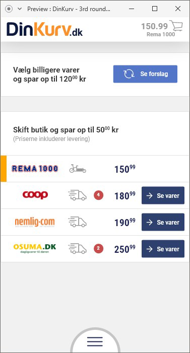
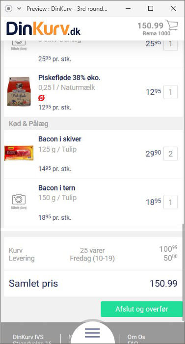
One of the biggest challange was to create an easy to use design for the basket screens. This is where the customers can see and compare their basket regarding to the actual prices of different stores. The main goal was to give them the option for comparing the raw prices, the prices with delivery and also give them information if some products are not available one of the stores.
One of the main functions of DinKurv.dk solution was the basket comparison option.
The basket compare screen with the basic information and with the delivery information what the customers can choose with tapping on the delivery icons.
The delivery icons show which delivery method the actual store use.
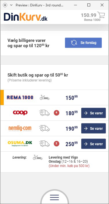
Here is the example was the REMA 1000’s basket where the delivery is possible and the icon shows they deliver the products with bike. Under the list the customer also get a detailed information about when the delivery is possible and how much will it cost.
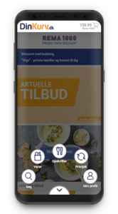
You can also see the dialer menu button at bottom of the screen.
(These screen made in Adobe XD prototype window/mode)
One of the main functions of DinKurv.dk solution was the basket comparison option.
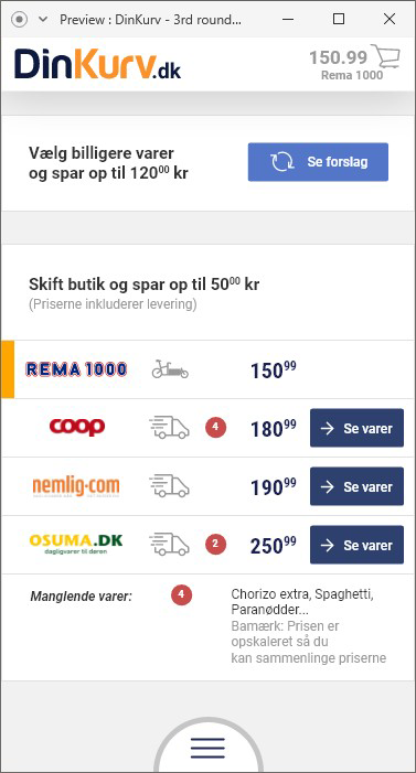
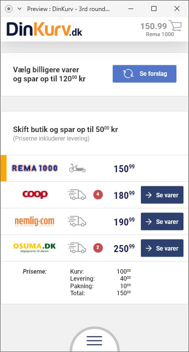
Here other two screens for the possibilities of basket screens.
On the left screen, the customers can see under the store choosing rows how many products are not in the actual store so they can switch to another store.
The second screen (right) shows the detailed version of the expenses with the whole basket. The customers can see the basic price, the delivery price, the packaging price and the overall price of the basket.
(These screen made in Adobe XD prototype window/mode)
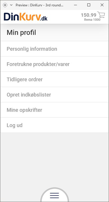
These screen were the most regular part of the UI layer. At the left, you can see the user’s profile page and right the actual content of the basket while the user browsing through it from up to down.
(These screen made in Adobe XD prototype window/mode)
For better understanding I created a video about the whole UI. As a showcase you can see all of the main elements of my UI development.
As you can see this was a horizontal high fidelity prototype.
This video is also made with the help of Adobe XD prototype mode.