This was a whole digital concept development process. Health treatment and exercising application for those people who are suffering in chronicle dizziness.
Based on the research and after narrowing the focus, the project’s scope was to make a web application as a digital solution for helping the treatment of the patients as the most efficient way as possible. The development process took into consideration the physiotherapist’s important role too.
After the first development phase I renewed the whole UI design. The project core is stayed unmodified while the interface style turned into a modern neomorph design. I also reworked the screen spaces for newer smartphones with bigger screens and camera island.
Table of Contents
Used tools and methods
User research
UX design
Customer interviews
Persuasive design
Service design
Designing the technological stack (PWA)
UI design
Prototyping
UI animation design
UI redesign (neumorph)
Adobe XD
Adobe Illustrator
Project management
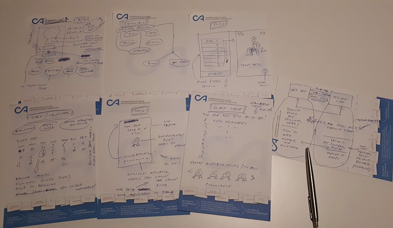
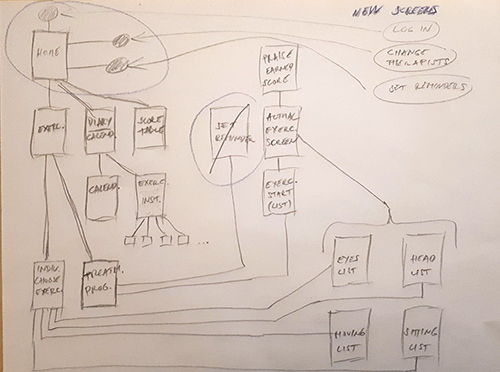
Data analyzing and sketches
After my research I analyzed the data and I started to understand the users struggles and needs.
The next phase was the pencil sketching where I laid the whole project basics and figured out how I could implement the most necessary elements. The UI design was also the part of the process.
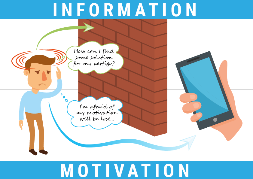
Here is the user journey map for the typical two different situations. Many people didn’t find any information or solution for their treatment. And the patients often worry about their motivation and they lose that more than in any other health or fitness application.
The focus was on the creation of simple and easy to use UI. The style is mainly basic flat design.
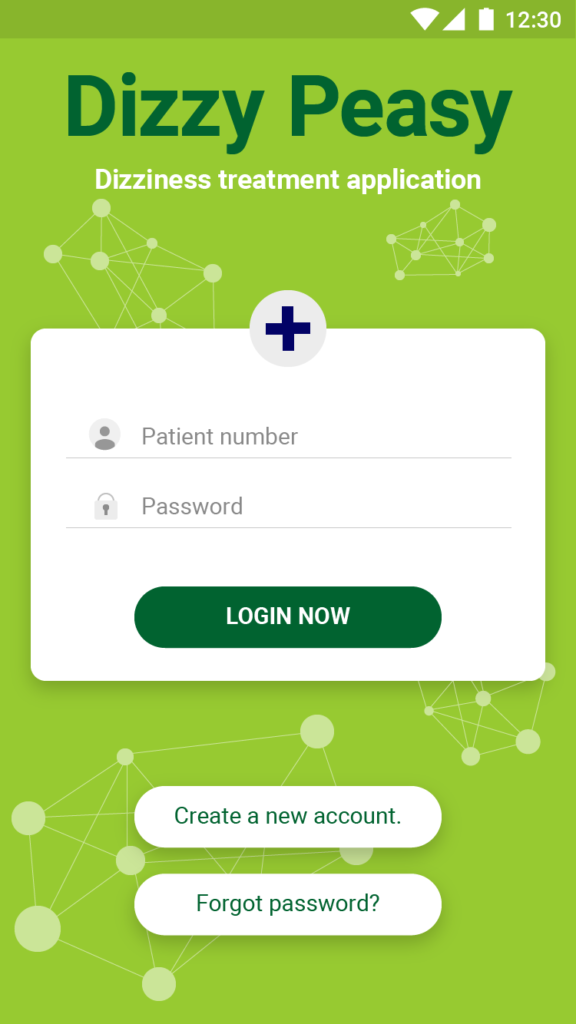
The funny name and the calm green colorizing is help to relaxing patient. The Dizzy Peasy (a reference to the “easy peasy lemon squeezy” phrase) suggests this treatment will be really easy.
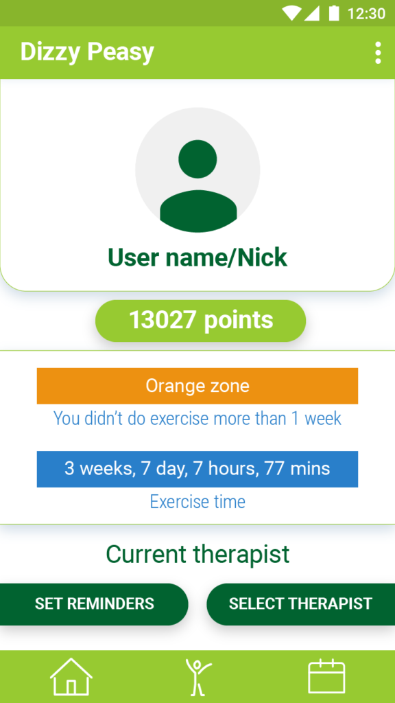
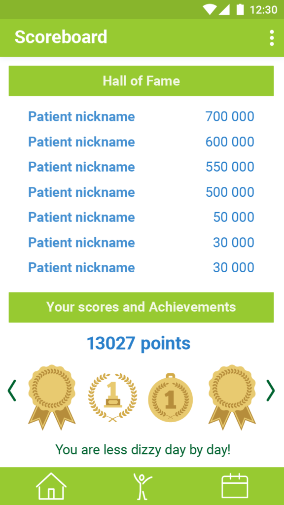
As the user profile screen shows the gamification was a part of my concept. I planned a point system that could be obtainable and collectable for the patient. It is helped them maintain the level of motivation. For the same purpose, the user has an achievement or badge system as well.
The main screen also give some information and feedback about the treatment process with two different indicator bar. This is also can trigger the user for doing more exercise. All of the data collected and stored on a backend server.
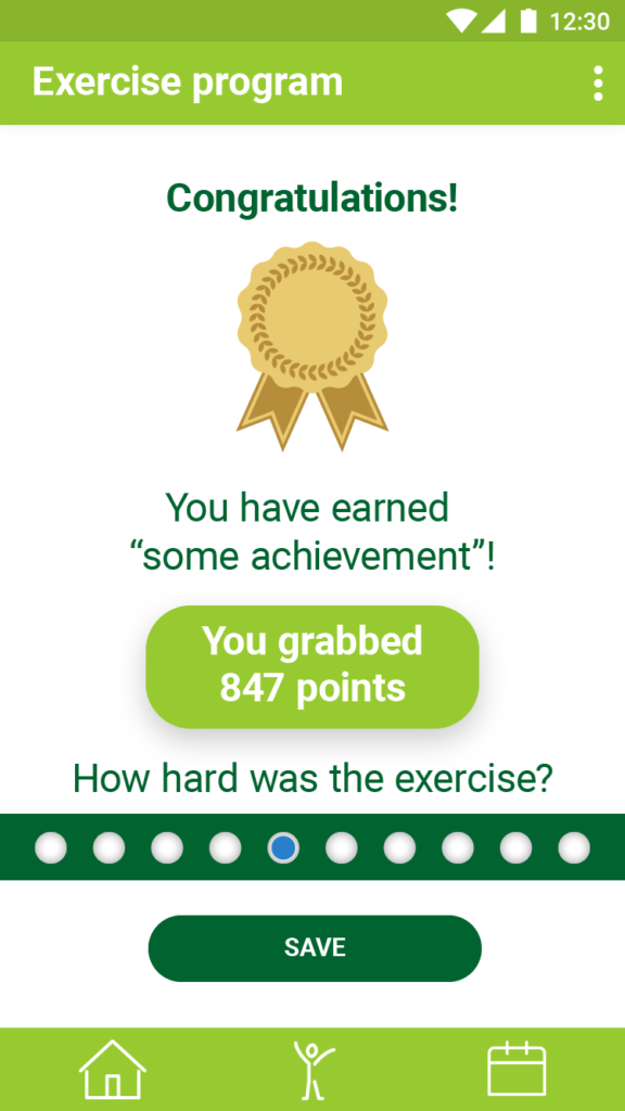
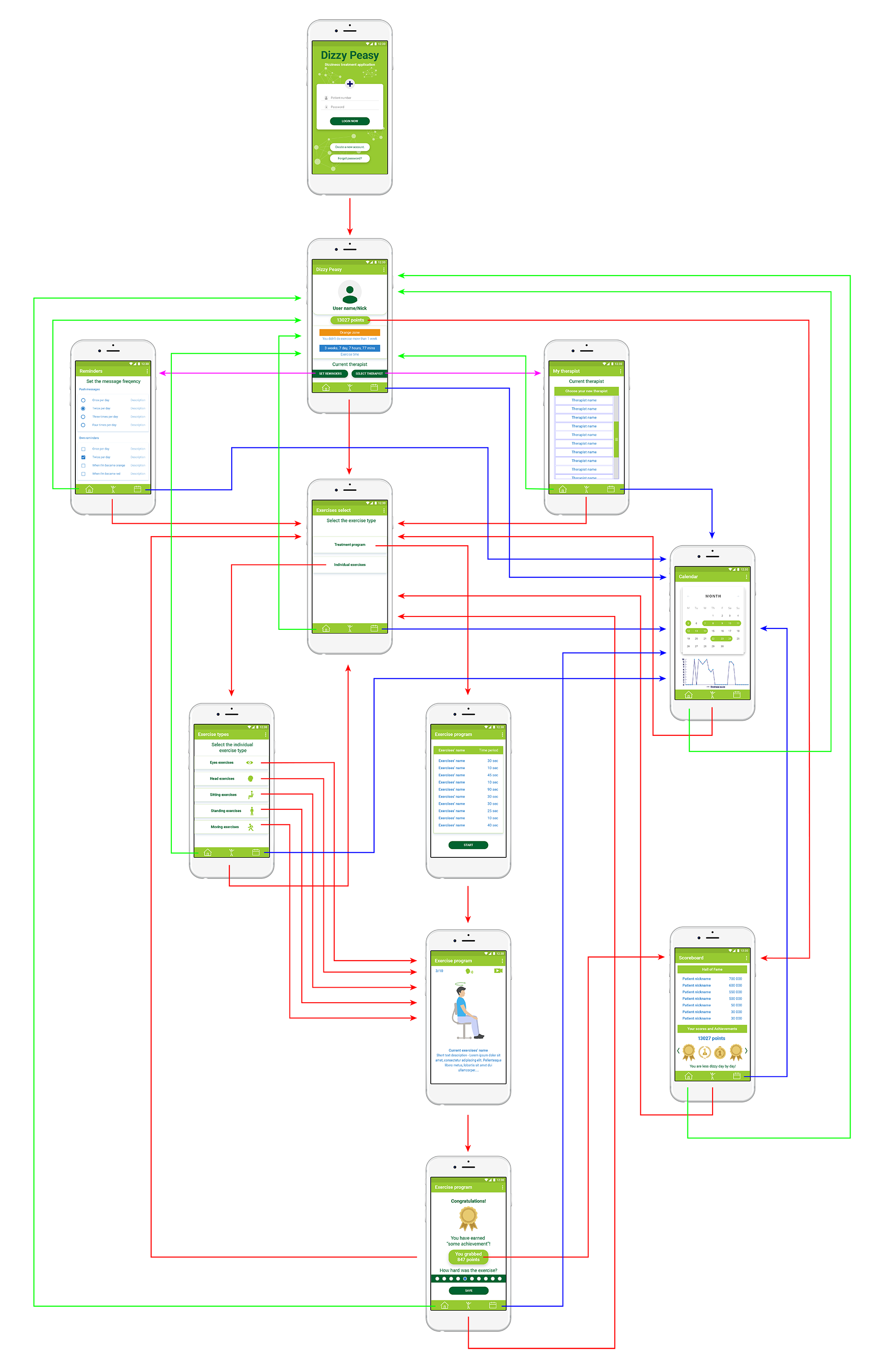
Here are the login screen (from left to right 1), main user screen with the indicators and the achievements screens (2). The first appears every time when a user finishing an exercise (3) while the other shows the collections of badges, achievements and a scoreboard (4).
...gamification was a part of my concept.
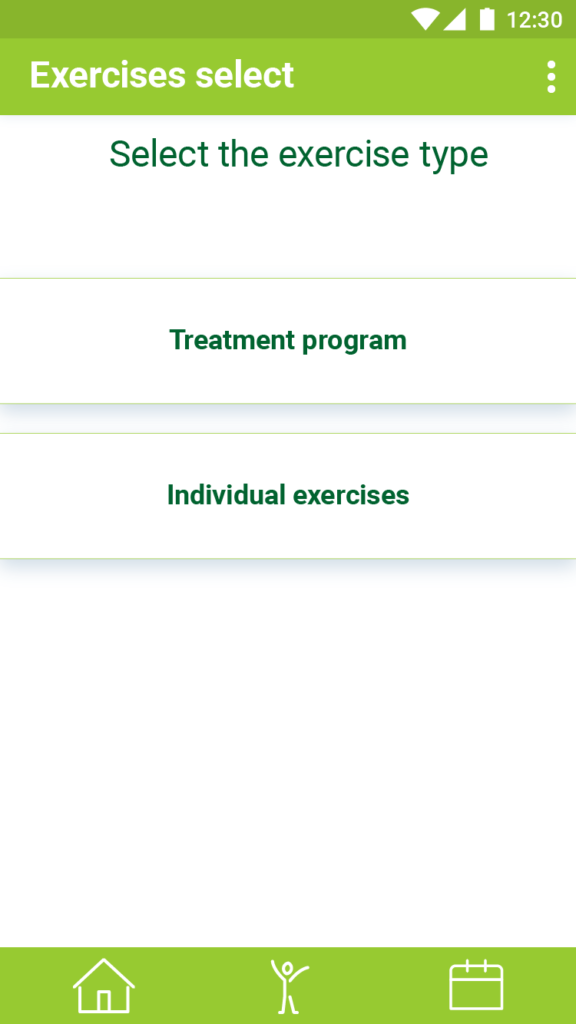
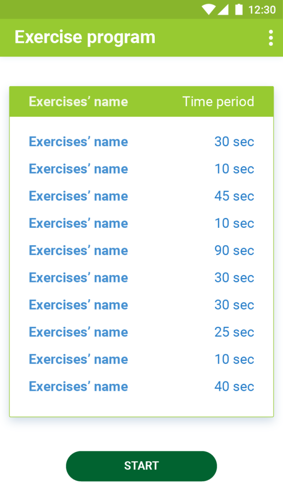
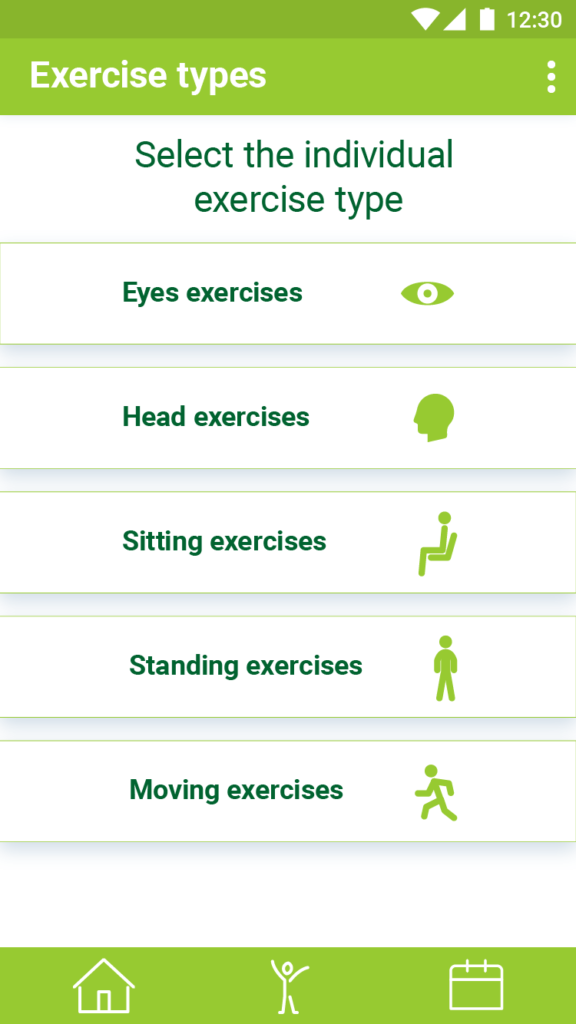
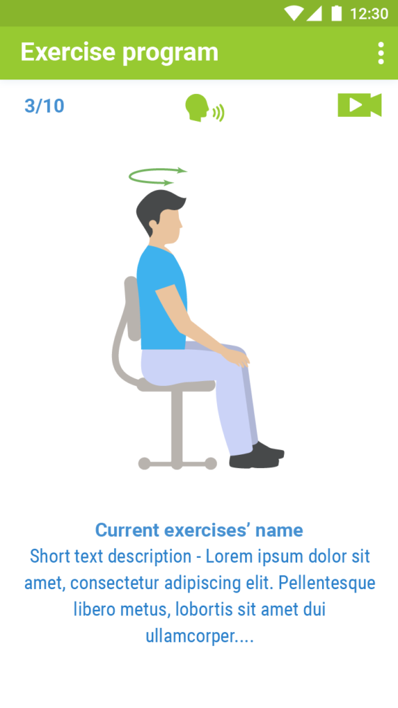
The exercise screens served the goals of the actual treatment program. The user had two main different possibilities for doing exercises.
From left to right 1) Exercise selector screen where the patient select a complete treatment or he/she can compile his/her own exercise program 2) Exercise screen with the exercise list of the Treatment program 3) Exercise types screen where the patient can make his/her own choices for the exercise program.
...I have implemented these scientific data combined with best practices.
This is where the actual treatment and exercises happen. As a digital concept developer, I got the description of treatment exercises. I also made my own research and I have implemented these scientific data combined with best practices.
While the patient doing the exercise several things can happen and all of those aiming to hold or level up the motivation.
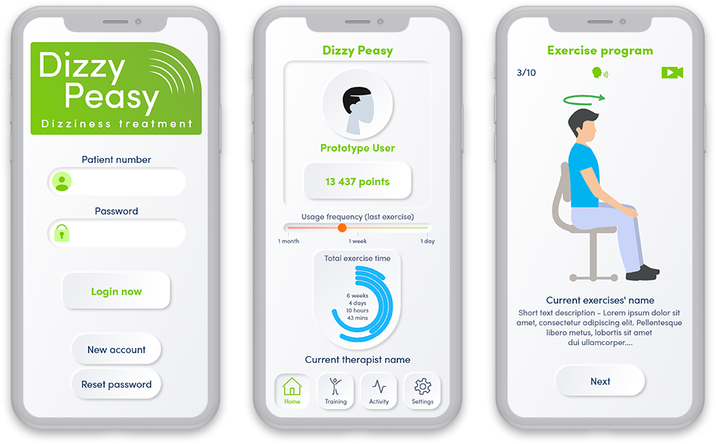
The upper left corner shows which exercise that the patient doing right now. The small head of the middle of the upper part of the screen indicates the voice assistant. If it’s on state (like now on the screen) that means the patient can hear the voice of the voice assistant. It helps the patient following the exercise steps. However some patient could find the assistant annoying or simply don’t want to hear the assistant voice. So that is why the option can be turned off.
The upper right corner works as a video assistant. If the patient try to do the exercises alone then he/she can watch a Youtube video about how he/she can do the actual exercise properly and safely.
The bigger part of the screen contain of the simple illustration about the exercise. I create a simple figurine style and animation for help the patient understand how they can do the exercise.
The lower part of the screen shows the name and the short description of the exercise.
With the usage of this structure the patient can set his/her own way to do the exercise without distraction but with many help as he/she needs.
I have implemented several necessary and convenient functions into the application which were giving some help to patients and the therapist as well.
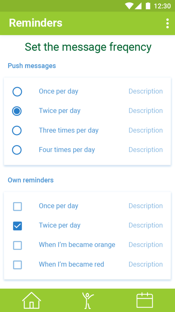
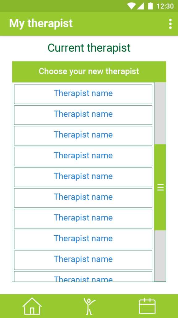
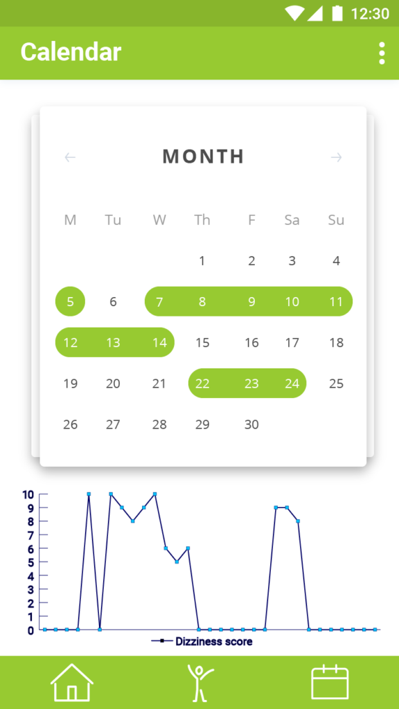
From left to right 1) The patients can set how they want to get automatic reminders from the application and push messages from their therapist. The goal was to avoid the annoying amount of reminders and messages otherwise it could be demotivating for the patients. 2) The patients can choose another therapist through the application with the usage of this screen. 3) The Calendar screen help the patients (and the therapist as well) to track the treatment and the level of process. As you can see above, at the end of the exercise program the patient can give a 0–10 point for how hard was the exercise or how much they felt the dizziness symptoms while they did the exercises.
...several necessary and convenient functions...
The application wireframe as blueprint design of the functionalities.
After the development I wanted to overhaul the whole user interface for a more stylish way. At the end, I choose the trendy neumorph style. The structure and the functions of the application stayed almost the same state as it were.
The new UI style shows greatest uniformity on all over the screens.
Only one consideration what it could be important that the application has less contrast – because of the new style – and that is may impair the usability.