
While I was working at an advertising agency one of my main tasks was the creation of DM materials. The source and the placement were always different and challenging. I made print materials, coupon cards, digital versions of the printed magazines and electronic terminal UI for this company. Here is a couple of examples from this time.
The Active Beauty magazine is the DM own branded magazine which issued monthly. I created or participated many printing design but this case was a bit different because the client wanted to upload these magazines to their website. At the agency my tasks was the conversion of these magazines to digitally readable versions. The main work was at another agency but my task was the special digital magazine creation which contained the advertising terms on the Active Beauty magazine. Basically it was a magazine next to a magazine but only for business partners. At the end we got two output. Every time it was a printed version besides the clickable PDF format.
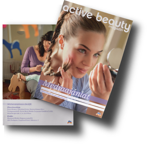
This is one of the issues cover and back cover. The high quality was a minimum requirement for creating these kind of magazines. DM has its own picture catalog with thousands of HQ and High-Res pictures. I really enjoyed the play with them.
The special magazine always contained the sizes and prices of the advertisement place. It also gave some insights to the partners about the next issues thematics and topics to help them make decisions over their advertisements.
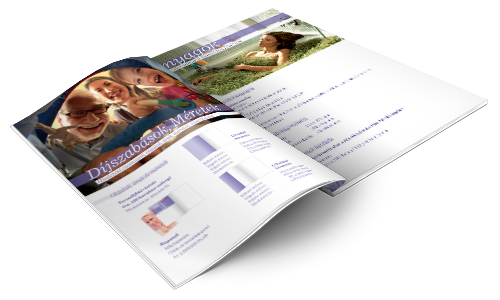
This was the time when the digital version has become more important than before. The DM marketing professionals used this small magazine to inform the partners about the current status of the Active Beauty magazine. That’s why I needed to make bookmarks and clickable links for the partners for helping them navigate between the possibilities.
...the client wanted to upload these magazines to their website (with) bookmarks and clickable links.
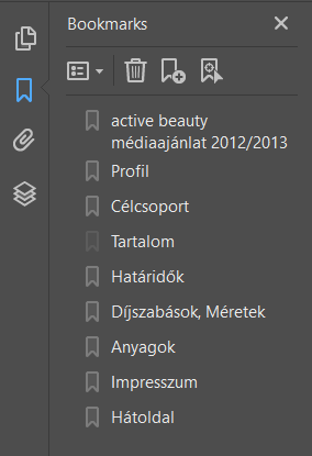

Here is two strong example what I had to help the partners exploring the possibilities about the advertisements. Bookmarks and clickable links. It also worked with email links which helped the partners to find an actual marketing specialist and to write them an email.
DM had a special customer loyalty program where the customer can bought and print coupon which offered 5-50% cheaper price for the specified products. The program only worked with the dedicated terminals in the DM shops.
I was the designer of these coupons.
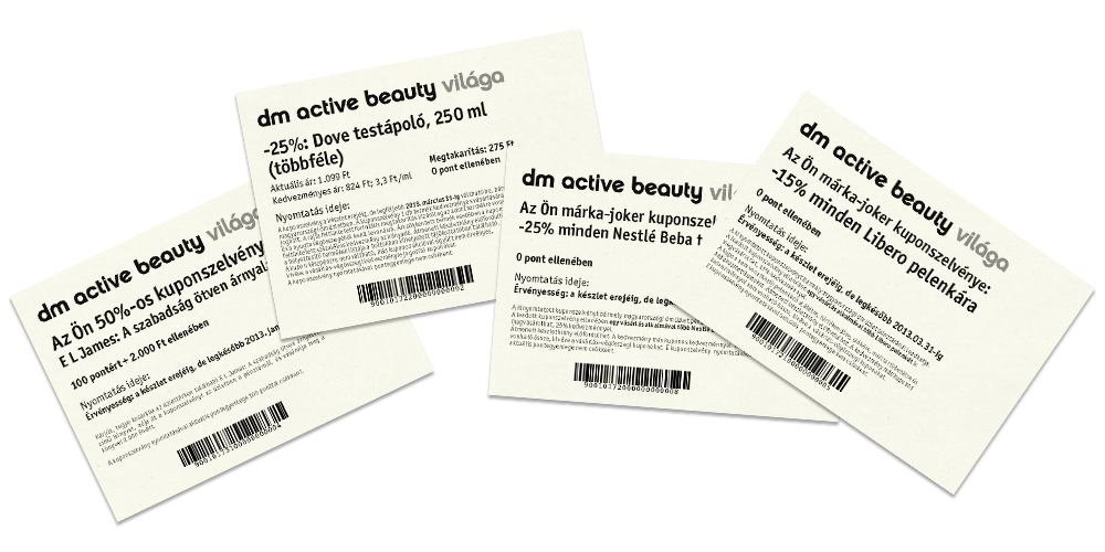
This is what the coupon actually looked like. It was important to design the appropriate size with B&W colors and I had to put on the barcode because otherwise, the printer in the terminal couldn’t handle it. All barcode was also made by me.
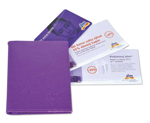
The part of the loyalty program was the preprinted color coupons, coupon cards (loyalty or customer card) and coupon booklets as well. I also was the designer of these things.
The DM loyalty program would not have been possible without the terminals. These terminals printed the actual coupons that I designed earlier. I have also contributed to the development of the terminal UI. I designed it to be as simple as possible for easy usage.
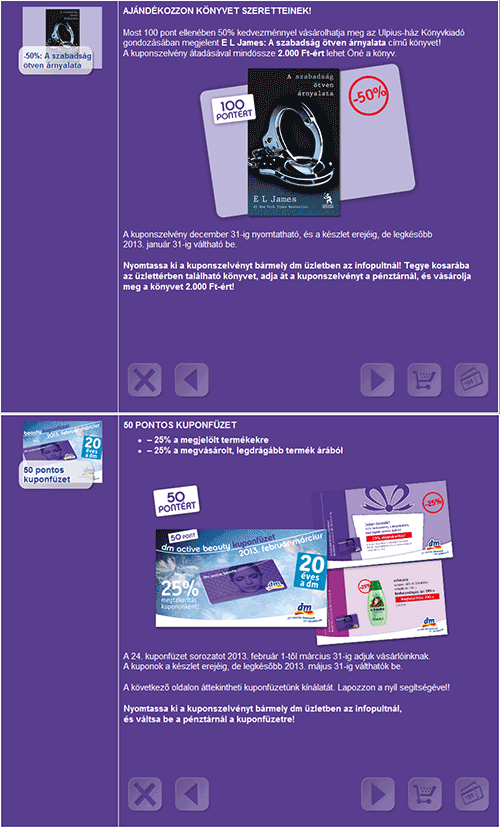
An example of the coupon selecting interface. The whole interface was created in simple HTML code with graphical elements.
I designed it to be as simple as possible for easy usage.
DM has been on Facebook since 2010. I also had to create advertisement pictures for Facebook post.
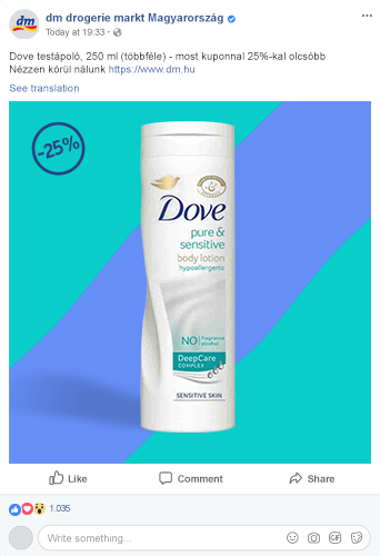
This is a typical dm drogerie markt Magyarország Facebook post where the picture was made by me.