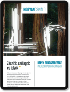
A tutorial article about how to organize a photo collection with Photoshop Lightroom. The functions were very close to the Adobe Bridge solution.
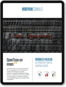
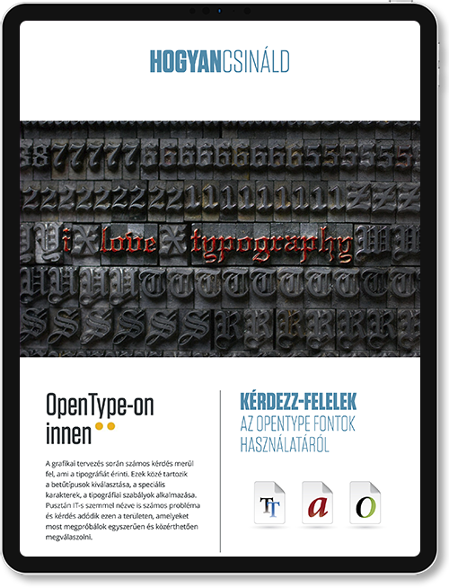
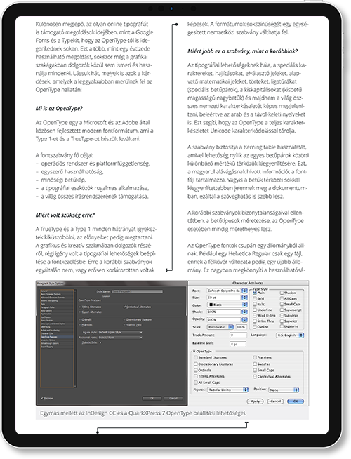
Advanced usage of OpenType fonts with Q&A session based on the readers and Hungarian Adobe User’s Group (HAUG) questions about the topic. A comparison of the three main font standard was also a part of the article.
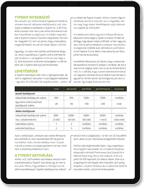
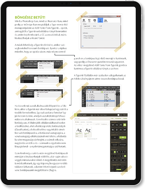
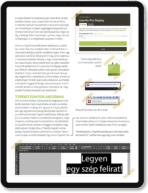
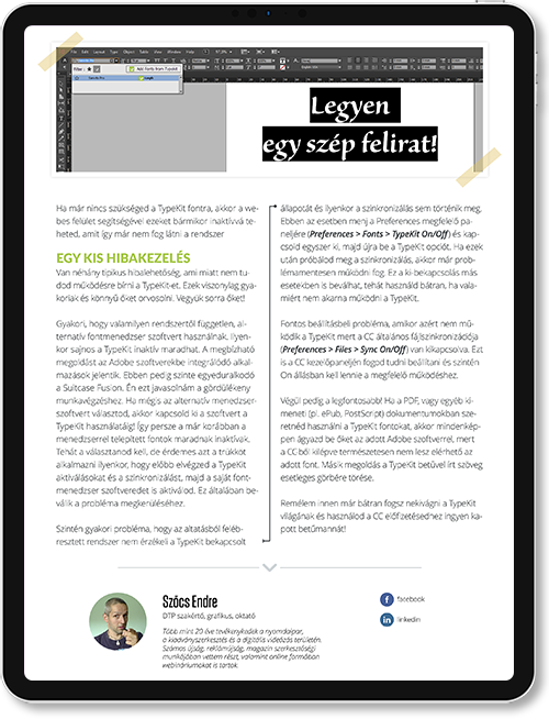
That was an article about the practical usage of Adobe TypeKit when it was new on the market and just made of its debut on Adobe Creative Cloud. That’s why the disadvantages of the solution was also a main part of this article as well. There were pros and cons back in the days.
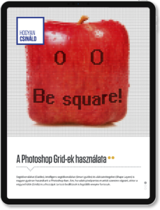
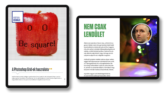
That was a tutorial article about the usage of grids and guides in Photoshop. It helped to understand how we can work within a pixel accurate project or create pixel arts. I also spent some focus on the Shape layers and their pixel accurate positioning.

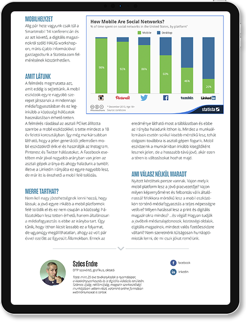
That was a simple analytic article about the future of personal computers and their usage next to mobile gadgets such as smartphones and tablets based on Statista data. I also looked at which kind of tools favored by user habits.

This was an intro article. My and my partner wrote these articles on the first page of our magazines. Usually these were a small analytics with our personal sights in order to what happened since the last issue and what topics were the hottest in that time.
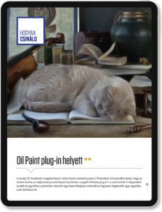
This article born as an answer for the many users who start to complain about the disappearance of Oil Paint plug-in in Photoshop. I wrote this guide for help them to create graphics with oil paint effect but without the original plug-in.
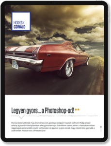
This article was also born as a reaction to members of the Hungarian Adobe User’s Group questions. They wanted to know how they can speed up their Photoshop. Many statement of this article still true in 2022.